
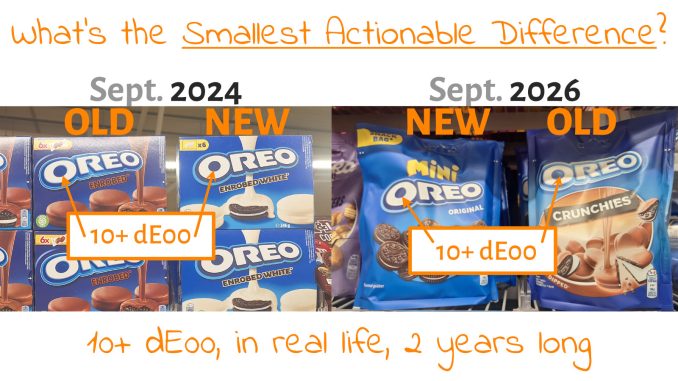
We need a new metric: the ‘Smallest Actionable Difference’ (SAD), to know which difference in brand color reproduction will turn off consumers and therefore hurt trust and sales. But lab experiments can’t determine this, since their basic setup influences results and creates findings that don’t transfer to a shopping experience. We need to infer the SAD from real-life observations. And this is where a two-year-long, real-life experiment comes to the rescue: the Oreo logo redesign.
CONTENTS: It’s confusing, that’s the least I can say… | With a little help from my friends | What should have happened? | One last check | But it’s a redesign! And only a small logo! | Don’t get me wrong! | The goal of the goal | Why is this important? | Updates
Originally published: 12/09/2026 – Last update: 29/09/2026
If you have been following my blog for some time, you may have noticed my articles on the Oreo logo redesign. I first noticed it in September 2024, and for a while they used both the old and new logos side by side in the shops where I do my groceries, which is why I wrote the article.

And even today, I still find some products with the old logo… Which is over 10 dE00 apart from the new one, it has a much darker blue. But when I checked the Mondelēz corporate website a few weeks ago, I noticed something very strange: the corporate website (oreo.com, left) still uses the old one, while the EU website (oreo.eu, right) uses the new one! What’s up???
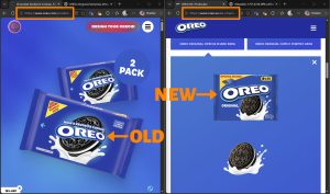
It’s confusing, that’s the least I can say…
What seems to be the case, is that they (first) launched the new logo in Europe, one with a flat design and a darker blue as the dominant brand color. I guess it might make sense to try something in one area first and, if successful, roll it out worldwide. But should that take two years?
BTW: the changes are quite subtle, you have to look carefully to notice. But it is a 10+ dE00 color difference, I measured a few packages, packages that were standing side by side on the shelves, even packages of the same product variety (the enrobed white).

The reason why I visited the Mondelēz website, was to check the Investor Relations information. I already did that over a year ago to see whether the annual report or any other report included information on Oreo sales figures. According to ‘conventional wisdom’ that some in the printing industry are spreading, even tiny differences in brand color reproduction should hurt trust and negatively impact sales. And here we have a 10+ dE00 difference between packages of the same brand. That should have ruined Oreo sales! But it probably didn’t, at least not enough to be worth mentioning in the year report.
But it gets even more interesting… One of the new reports I found on the Mondelēz website, is a presentation for the Consumer Analyst Group of New York (CAGNY) Conference, from early this year (17/2/2026). This has a lot of information. And pictures. And check out the following pages covering Mexico: 54, 55, and 56. On page 54, that’s the old Oreo logo. On page 55, it’s a bit harder to see, but the locomotive features the old one, and the box next to it has the new one (that one doesn’t seem to have the 3D glow typical of the old logo). But do go to page 56, the ad and those packages definitely have the new logo. And check out the sales numbers: they consistently went up. Of course, sales numbers are influenced by many factors, it’s very difficult to figure out the result of a single factor changing. To know if color deviations influence sales, or not, you should set up an experiment where only that one factor is changing. Which is extremely difficult. And which hasn’t been done, as far as I know. I haven’t found any study on that.
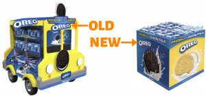
So here we have a presentation by Mondelēz featuring both old and new logos…
Page 53 also includes information about Brazil. Since I didn’t recognize one of the product images, I did an internet search, which led me to the Oreo Brazil website. And again, an interesting surprise: the first part of the homepage contains the new logo, but when scrolling down to the second ad, it’s the old one…

So here we have corporate websites and product websites using a mix of both old and new logos, with a different blue. From a print production point of view, it’s quite a different blue. And nobody seems to notice? Or seems to care?
With a little help from my friends
With these different versions in mind, I asked my friends on LinkedIn to send me pictures of Oreo packages on shelves in a nearby shop. Multiple people did, and you can see a selection at the end of the article. And one of them, Vitaly Portnoy, mentioned that the packages (the products) originated from different countries… which was an interesting observation.

Well-known Dutch print expert and author Henk Gianotten noticed something similar. In a shop he visited, he found Oreo varieties that come from parallel (or grey) imports… You can spot it on the ingredient list/nutrition information: a Dutch version is added to the package with an extra paper label.

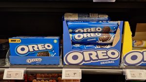
So I checked the packages of similar Oreo products that I bought the other day: a Mini Oreo Original (with the new logo) and an Oreo Crunchies (with the old logo) that were standing next to each other on the shelves, you can see the picture below.

In case you didn’t know: you can look up information about the product via the barcode on the package, e.g., the country where it is intended to be sold… So I checked both barcodes, and immediately I noticed something I hadn’t expected: both have the same country code…
Via the GS1 website, I found both were registered by Mondelēz Schweiz GmbH (Switzerland), and both were created for sales in Belgium and the Netherlands… So the theory that logo use depends on the country of sale isn’t valid. You can check it yourself, by entering the barcode number in the ‘Verified by GS1’ service: the Mini Oreo: 7622202386213, the Oreo Crunchies: 7622201125660. BTW: another package with the old logo that is being sold in shops nearby is registered by ‘Mondelēz Kinh Do Vietnam Joint Stock Company’… (barcode: 8934680033442)
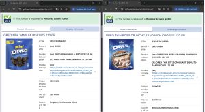
On closer inspection, I noticed a few minor differences in the ingredient list, especially in how the language is identified. The Mini Oreo starts with the identification (BE) (NL), which is for Dutch, the language spoken in the northern part of Belgium and the Netherlands. The French version, spoken in the southern part of Belgium, is next and is identified as (BE) (FR). The Oreo Crunchies, however, start with French and identify it as (BE), not (BE) (FR), which makes me think different agencies or studios make the packages. And maybe the Oreo Crunchies one didn’t get the memo that the logo has changed?

In case you are wondering, I also checked the ‘Best Before’ dates of both: the one with the new logo (mini Oreo) is 31/03/2027; the old logo (Oreo Crunchies) is 28/02/2027. So production dates must have been quite close. It’s not that the one with the old logo was produced a long time before the new one.

I also checked the website of AH, one of the dominant retailers in the Netherlands and Flanders, and searched for Oreo. Here’s an overview, including whether the package shows the new or the old logo.

Whatever the reason for the use of two different logos in real life, it’s a unique situation. Unknowingly, Oreo has been executing a real-life experiment, with 10+ dE00 color differences, on a very large scale, and this for two years already.
BTW: when I posted that image above, with the two packages, on LinkedIn a few months ago and asked, “Did you notice?”, a post that was viewed by more than 700 people, only two joked a bit, but nobody was outraged by the simultaneous use of the old and new logo, which are 10+ dE00 apart… And for the record: most of my network are people involved in printing.
What should have happened?
Let’s take a look at the different possible scenarios of what could and should have happened when a brand uses two different logos with a 10+ dE00 color difference between them for the same product line.
The first scenario is that the printing industry myth is true and that this 10+ dE00 did negatively impact Oreo sales. In that case, Oreo product managers should have seen a sales decline. I can’t imagine a company like Mondelēz doesn’t meticulously track sales. The chance of that scenario is close to zero, the slide from Oreo Mexico that I mentioned above shows that they do follow up on sales numbers.
When a decline in sales is noticed, product managers and marketing managers should research the reason for the decline. And take appropriate action.
They may not have noticed the difference in logo usage, but in my opinion, that’s also close to zero. And if they didn’t, that’s proof that a 10+ dE00 doesn’t get noticed, well, that is: not outside the press room, outside press checks. When the focus is on tiny color differences.
If sales declined and the product team noticed the different logos, they should have acted and streamlined use of the new logo. They would have addressed the packaging design and production flow and realized someone didn’t get the memo that the logo changed a long time ago. And they would make sure the new logo was used on the next batch of packages.
Could they have used the remaining stock of packages with the old logo? If there was a noticeable decrease in sales, that seems very unlikely: the old ones would be discarded immediately, and a new, correct package would be produced with the highest priority. But that didn’t happen: two years after I first noticed the new Oreo logo, I’m still seeing some packages with the old one… Why???
Which leaves only one reasonable scenario: it didn’t impact their sales. Nothing significant happened, despite all the fear-mongering by color consultants and providers of color-related solutions that even a small difference would hurt trust and sales.
My friend Henk Gianotten, who got an early copy of this article to check my chain of thought, mentioned that I forgot something: the need for a capable, user-friendly digital asset management system, which should be mandatory for everyone involved. And right he is! The only way to ensure everyone uses the right logos, with the right colors, is to include them in a mandatory system. But it needs to be user-friendly, not only from the point of view of finding the information fast, but also by providing the interface AND all information available in ALL local languages… to make sure everybody understands the system, the instructions on the use of the logo, and the colors.
So, I did a little check, and it seems that Mondelēz does have such a system. Or I should say: systems. I immediately found two: Spotlight – One-stop shop for all Mondelēz International digital assets and the Mondelēz private Brandfolder. Is that why the Oreo logo is used inconsistently? Maybe…
BTW: if you know more about how Mondelēz shares logos and instructions with both people inside the company and its subsidiaries on the one hand, and external subcontractors like design agencies and prepress houses, please leave a comment!
One last check
To make sure that I didn’t miss something. I also asked my little assistant, Google Gemini, to do some deep research. This was my question: “Have there been discussions in online fora or on social media about Oreo using two different logos? If so: summarize them. And include the references to these discussions.”
The answer: “The short answer is no—there has been virtually zero widespread consumer chatter or viral outcry on general social media about the dual-logo presence.
While drastic packaging updates usually spark threads on platforms like Reddit (e.g., complaints about “shrinkflation” or ugly rebrands), the subtle nature of the Oreo logo tweak meant the everyday consumer simply didn’t notice or care.
However, the phenomenon did spark active discussions in specialized professional networks and design communities, focusing on print quality, brand management, and shopper psychology.
- The Print & Packaging Industry (insights4print.ceo & LinkedIn)
The primary driver of discussion was print media expert Eddy Hagen, who dubbed Oreo’s transition “the biggest print quality experiment ever.”
- The Core Debate: For decades, brand consultants have insisted that print consistency must stay within extremely tight tolerances (under 2 ΔE00) to prevent loss of customer trust. Hagen pointed out that Oreo’s new dark blue and flat logo shifted the brand color by over 10 ΔE00 while sitting on the same shelves as the old 3D version.
- Industry Social Media Reaction: When Hagen shared this case study on LinkedIn, print and packaging professionals debated the real-world impact. While quality control specialists defended strict tolerances for production standards, others conceded that consumers simply don’t register these shifts due to imperfect human color memory.
- Graphic Design Communities (r/Design & r/graphic_design)
Within graphic design subreddits, posts comparing subtle packaging variations (like Cadbury-produced Oreo regional variants vs. standard Mondelēz packaging) regularly pop up, but the 2024 flat-logo rollout was treated as routine rather than controversial.
- “Flat Design” Fatigue: When designers do talk about the shift, the sentiment leans toward light fatigue over the broader corporate trend of “de-branding”—flattening 3D gradients and drop shadows into simplified vector marks.
- Seamless Co-Existence: Designers noted that because the foundational letterforms, white fill, and blue container shape were preserved, the two logo generations blend into the same visual identity effortlessly on store shelves.
- General Consumer Forums (Reddit & X)
On consumer-facing communities like r/snacking or r/mildlyinteresting:
- Discussions around Oreo packaging almost exclusively focus on recipe shifts (e.g., complaints about “cardboard” taste or cream density), flavor line extensions (like Red Velvet or Gluten-Free variants), or shrinkflation.
- Because the logo change was evolutionary rather than revolutionary, consumers subconsciously processed both old and new packaging through “System 1” thinking (quick visual recognition) without ever noticing that two distinct logos were sitting side-by-side.”
If a 10+ dE00 color difference would mean that consumers would lose trust in the brand, shouldn’t there have been outrage in online forums and on social media? In the online world in 2026, people immediately complain about everything on social media and in other forums. But it seems that this redesign and the 10+ dE00 color difference just passed unnoticed…
But it’s a redesign! And only a small logo!
Some will probably argue that it’s a redesign, and it’s different in that case: consumers accept larger deviations. Really? Do you think some magical part of a consumer’s brain will immediately, in a split second, know whether it’s a redesign with an acceptable different color or the old logo with an unacceptable color difference? The Oreo logo redesign is very subtle, unlike the infamous and disastrous Tropicana redesign. The general form stayed the same; it only went from 3D to flat. Even when you know this, you often have to look closely to tell whether it’s the old or new form. The same goes for the redesign of the Dallmayr logo, which I will show below.
And, yes, for those who want to use that argument, it is indeed only a small logo. That could make it harder to spot the color difference. But let me share some more pictures from the past where a large portion, or even the full package, deviated.
Dash (detergent) has been showing a blue-to-purple shift in their packaging for some time now.
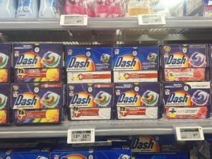
Another blue-to-purple shift is from Prince biscuits. But that color shift doesn’t seem to hurt sales. What impacts brand recognition, is that red one. That’s not a different brand, that’s also Prince. But still, after knowing this, I don’t associate that one with the Prince brand. It’s too different.

Kellogg’s launched a new variety of their Trésor breakfast cereals. Check out the difference between the two adjacent packages. That’s an 8,9 dE00 color difference. And this is probably done deliberately. But you can’t, on the one hand, claim that a 4 dE00 color difference is negatively impacting sales and, on the other hand, create a new package with an 8,9 dE00 color difference by default. BTW: the choice of a darker red for the cereal with the white chocolate inside – that’s counterintuitive to me.


To make it even more complex – or interesting – Trésor also has a third and forth variety, which are yellow and blue.

Dallmayr, my favorite coffee brand, also did a redesign, going from a lighter to a darker blue. And when I posted a nice story about it on LinkedIn – how much I love this coffee, including the image below – nobody called it a nightmare…


BTW: check out these comments that I got on that post. And for the record: the one who is stating that he is easy is someone who, on other occasions, is heavily pushing tiny tolerances… On other occasions when he is selling his services, but in private, when he is a consumer instead of a salesman, he doesn’t care… Think about that.

And last but not least, check out these Coca-Cola cans. They were bought in at most a few months, more like a few weeks. But nobody seemed to have noticed. There was no recall action, and no mention on the website that a production error in the packaging led to a slightly different color. This makes me conclude that no consumer asked questions about it or complained to Coca-Cola.
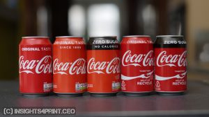
And from that same time periode, a picture of a vending machine…

Here are a few more pictures of Coca-Cola packages in real life from a few weeks ago, right after the launch of the new design.


It seems only the people in print complain about these kinds of color differences, when doing press checks or when posting on LinkedIn.
To that point, check this comment on LinkedIn…

And think about that: if consumers won’t notice, if it won’t influence their buying behavior, and it’s only the brand owners that want those tiny tolerances, does maintaining tiny tolerances add any value to the customer of the brand, the people that are buying the products and thus generating review and profit? If it doesn’t add value and brands are spending huge amounts of money on maintaining those tiny tolerances, isn’t this the kind of cost that is considered waste in many management books, by many management consultants? Think about that…
That comment went on with this statement.

Critical print buyers obviously love statements like that. But let’s check reality, like in the picture below: try to get the color consistent across folding carton, foil, and corrugated… Unless you are happy to standardize to the less vivid colors of the corrugated packaging, the smallest gamut.
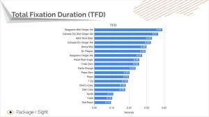
BTW: do you know how long a person looks at a package during shopping, the ‘Total Fixation Duration’? Eye-tracking in real world settings has revealed this: usually less than a second. Tests with Coca-Cola: 0,1 second, yes: one tenth of a second. Just enough to see that it’s red, that it’s the Coca-Cola typeface and the detect the ribbon. ‘Predictive processing‘ only needs a few rough clues to make our brain decide that the chances are very high that it’s Coca-Cola and will grab it.
Don’t get me wrong!
Now, don’t get me wrong: I’m not promoting bad print quality. And all the tools that help printers get consistent results will improve efficiency and therefore their bottom line. What I’m saying is that no FMCG print job should be rejected for a 2 dE00, or even a 4 dE00, color difference, on the argument that a consumer would lose trust in the brand because some pundit made such a claim without any proof. If you want a 2 dE00 tolerance, remember it’s premium quality, and you should be willing to pay the premium price. Also, use the more expensive materials (like substrates) that come with premium quality.
In case you didn’t know: the net profit margin of an average printing company is single-digit, even on the lower side of the single digit. They don’t have much room to absorb rejected jobs, especially in, e.g., folding carton, where substrate cost alone is around half the total cost. Think about that.
And printing is a complicated process, with lots of variables, each with its own tolerances. If you know how complex printing really is, you will be amazed that those press operators can ever reach tiny tolerances… And if you don’t know how complex printing is, follow Carmon Madison a follow on LinkedIn, he is creating an incredible resource on everything that can vary in printing on his All Things Print website. Highly recommended!
BTW: in case you didn’t know, ISO 12647-2 makes a distinction between the deviation tolerance and the variation tolerance. The deviation tolerance is between the absolute reference aim value (e.g., CIELab values) and the approved print sample. The variation tolerance is print-run variability: fluctuations within a single production run. I should also mention that the feasibility of tolerances depends on several decisions, e.g., the use of percentages of a certain ink and the quality of the substrate. A few years ago, when I was a bit bored, I took many measurements at different spots inside one package, a folding carton, and put these results into a matrix. This is the comparison of one of the colors, one that was not a spot color but a simulation.

And if you wonder why you can see those differences inside the same package, it’s not just the printing (ink density, dot gain), but also the substrate quality. Check these images of one of the packages I measured. If you were to put the spectrophotometer on the ‘wrong’ spot, that might already pass the tolerance threshold, while the rest of the print is well inside the tolerance. Think about that. And do check this yourself: take a loupe and closely look at the consistency of printed dots across a package.

And if you want to argue that these are only small spots, the control bars are also very small these days: 5 by 5 mm squares in the case of the Kellogg’s boxes below.

You can read more in this article: Is Print Quality Control Russian Roulette?
The goal of the goal
One of my colleagues at my real job eats breakfast at work. He likes Kellogg’s Special K. Earlier this year, I noticed the package didn’t look that good. The red brand color looked good, but the rest of the package just didn’t. When I asked him about it, he said he noticed the packaging quality wasn’t at the usual level, but he still bought it because he really likes Special K cereal.
What is interesting about that package is that it’s probably within specifications: the red looks like Kellogg’s red. But the light blue at the bottom has a lot of mottling (unevenness). The darker blue on the side looks dull (there’s something wrong with it). And the flocks of cereal, there’s also something wrong with these…
(I have to point out that the picture below looks better than the real package)

And this brings me to what I just read in the book ‘Reset – How to change what’s not working’ by Dan Heath: what’s the goal of the goal?
The goal of print quality control in FMCG packaging is getting that brand color within a tiny tolerance: a small dE00, that’s the KPI. And with that narrow focus, how the rest of the print looks might be neglected, as in this Kellogg’s package… The Kellogg’s red looked good, the rest did not.
But what was the original goal of that tiny tolerance, that dE00 KPI? Well: FMCG packaging should look good, it should look appealing (enough) and trigger people to buy it, next to having the visual cues to detect it among all the other offerings. That was the clear goal in an era when spectrophotometers were an expensive rarity and print buyers had a background in printing and helped press operators on press to get the right look. With the advent of affordable spectrophotometers, however, that ‘looking good’ was reduced to just one parameter: a tiny tolerance of the brand color. Which is the wrong approach: the red in that box is within tolerance, but the package doesn’t look that good. It’s better to have a package that looks good, without any print issues, but with a brand color outside that tiny tolerance than the other way around.
And there’s also a danger with specific KPI’s: when a KPI is always met, management books state that the KPI should be adjusted and be tougher to achieve: the race to lower color deviations, even beyond the point consumers will notice them while shopping. Far beyond the goal of the goal.
BTW: if you are looking for a print related KPI that can be adjusted over time: makeready times and setup waste. There it does make sense to raise the bar over time.
What does get noticed, and what will probably impact sales, is damaged packages or packages with clear print defects. Below are two examples. The one from Kellogg’s looks like someone spilled chemicals on it! The only reason I bought that one was to show it to you.


Why is this important?
This is something I could only have dreamed of: a test setup with two versions of a logo, with a 10+ dE00 color difference, in a real-life setting, with real consumers shopping for that product, and this for 2 years long already. This is a priceless experiment—my eternal gratitude to Mondelēz for this.
And the result? As far as I could find out: nothing happened. There are no indications that sales numbers dropped (significantly), check the results from Mexico that I mentioned above.
There was no outrage on social media or in online forums. Only a few people noticed that something had changed. Even the people at Mondelēz are using the two Oreo logos in their presentations, sometimes even on the same page, as if they don’t notice, don’t care, or that it doesn’t matter at all…
It only reinforces my opinion that we need a new metric: the ‘Smallest Actionable Difference’ (SAD). How different can the reproduction of a brand color be before consumers stop buying the product because they lose confidence in the product and the brand? Based on this two-year, real-life experiment, the magnitude of the SAD might even be above 10 dE00. Which is far higher than the Just Noticeable Difference (JND) and the Just Acceptable Difference (JAD), both of which were determined in lab conditions, not in real life. And far higher than the often-stated 2 dE00… Further research, in real life, by observing consumer behavior while shopping, is definitely needed.
PS: if you are confused or offended by this suggestion to raise the tolerance for brand color reproduction and would like to point out ‘all those studies’ that show that a small color difference will impact sales, show me those studies. Really, I want to see them. I want to know what was tested and how it was tested. E.g., that study showing color enhances brand recognition by up to 80%, the quote that is used very often to justify tiny tolerances, well, that one is on the use of color (in general), compared to no color (meaning: black & white) in newspaper advertising. It does not cover small differences in brand color reproduction. Even the book ‘buy.ology – Truth and Lies About Why We Buy’, which I read recently, only touches on color as in color categories; there’s nothing in it about accurate color reproduction. And the author, Martin Lindstrom, recently shared that form plays a more important role in brand recognition than color. If a Coca-Cola can featured a different typeface in the logo, that would raise suspicion, a slightly different color, like the ones I’ve shown above, didn’t. And also another book on consumer behavior – ‘Consumer.Ology: The Truth about Consumers and the Psychology of Shopping‘ only talks about color in general terms.
BTW: I’ve been asking this question to show me these studies already for a decade. And I still haven’t seen any evidence for that claim about tiny tolerances and trust yet. The only studies I did see were very general about the importance of picking the ‘right’ brand color (as in color category: red, blue, yellow, …), and then comparing a handful of color categories. I have not seen any study yet on small color differences and their impact on sales. Except for this two-year-long experiment by Oreo, which I just described.
Please remember: most color related experiments are done in a lab environment, where people are asked, e.g., whether they notice a color difference (JND) and whether they find it acceptable (JAD). The colors are either shown on a monitor or as flat samples in a light booth, conditions that look nothing like the real world, outside a lab, or pressroom for that matter. And just asking that question will already bias the results in a certain way and make conclusions invalid for shopping: the question will immediately activate System 2 of our brain, the slow but accurate part, while during shopping System 1 will be active: the fast but inaccurate part. And that makes a huge difference.
Martin Lindstrom recently had an interesting LinkedIn post about the challenges of consumer research, citing the Hawtorne effect. Which was what I witnessed in an experiment I set up over a decade ago: about 1 out of 3 ‘print professionals’ claimed to see a color difference between identical samples… One even said it was a big difference.

Another recent interesting post, was from the Colour Literacy Project, they have made the first volume of ‘Advances in Colour Literacy’ by dr. Ingrid Calvo Ivanovic free to download.
A snippet: “A third structural feature is what I will call programmed ignorance. The literacy gap produced by the misclassification is not neutral in its consequences; it is exploited.
Industries that operate on color — trend forecasting agencies, colour-of-the-year marketing, branded colour systems, seasonal colour theories, colour-driven cosmetic and fashion verticals — depend on a public and a design profession that do not have the literacy to subject their claims to scrutiny. The annual colour of the year is the clearest example: an editorial-commercial product packaged as cultural insight, sold to a public and to designers who lack the literacy to ask what is begin claimed, by whom, on what evidence, in the service of whose interests. The misclassification is not maintained only by passive inheritance; it is maintained because the literacy gap is commercially productive for actors who benefit from colour being treated as mysterious, fashionable, and superficial. I do not claim that these actors actively engineer the gap. I claim that the gap is useful to them, that they participate in the discourses that reproduce it, and that the discipline of design — by failing to equip its practitioners with colour literacy — is a partner in producing the conditions of its own colonisation by colour-commercial interests.“ (page 249, 250)
PPS: if you are an editor or blogger, please note that this article is protected by copyright, which does prohibit you to copy it. If you are interested in republishing it, contact me to make a fair deal (which means: pay a fair price). If you don’t want to pay, you can publish a one paragraph summary and a link to this article. I have put a lot of work in this article, this should be honored.
Some more pictures, from my friends


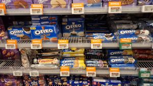


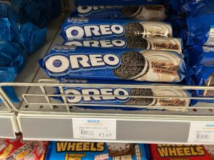
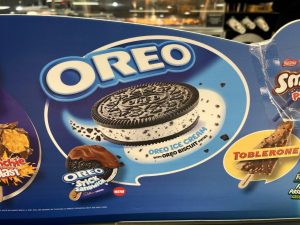

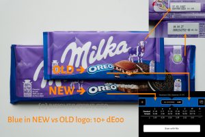
UPDATE 29/09/2026: Here’s an interesting catch from this WE. A small and a large package of Milka Oreo, which were standing side-by-side on the shelvers. The small one has the old logo (3D design), the large one the new logo (flat design). And guess what: the ‘best before’ date of the small one is AFTER the one from the large one. Being the same product, just a different size, this means the production or packaging date of the package with the old logo must have been after the production or packaging of the large one…
And the blue accent color at the bottom, that’s 4 dE00 apart. I also measured the purple, I didn’t see a difference at first, but that was close to 2 dE00…


Be the first to comment