

What is the decisive element that makes you recognize a brand? Many in the printing industry will say color. But I would like to differ: it’s shape, over color. A small test I did shows this. As well as many (in)famous rebranding efforts, by well known companies.
CONTENTS: A Small Test | Silly Discussion… | Brand Redesigns | Why is this important?
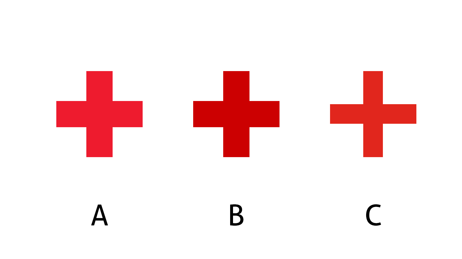
Some time ago, I published an article on the Red Cross brand colors. It also included a small test, with three variations of the Red Cross logo. They all three had a slightly different color, one of them had a slightly different shape. The tricky part was that all three colors were right: as I showed later in the article, I found multiple definitions of the Red Cross red…
This is the test, with the three variations of the Red Cross logo.
Below you can see the result of this small test.
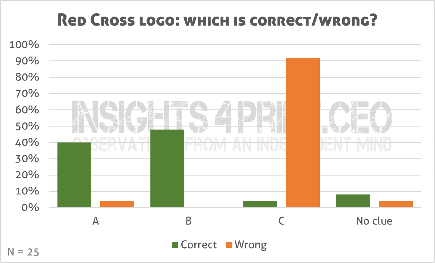
Almost everybody was convinced that C was the wrong one, this is the one with a slightly different shape. But there is disagreement which one is the right one.
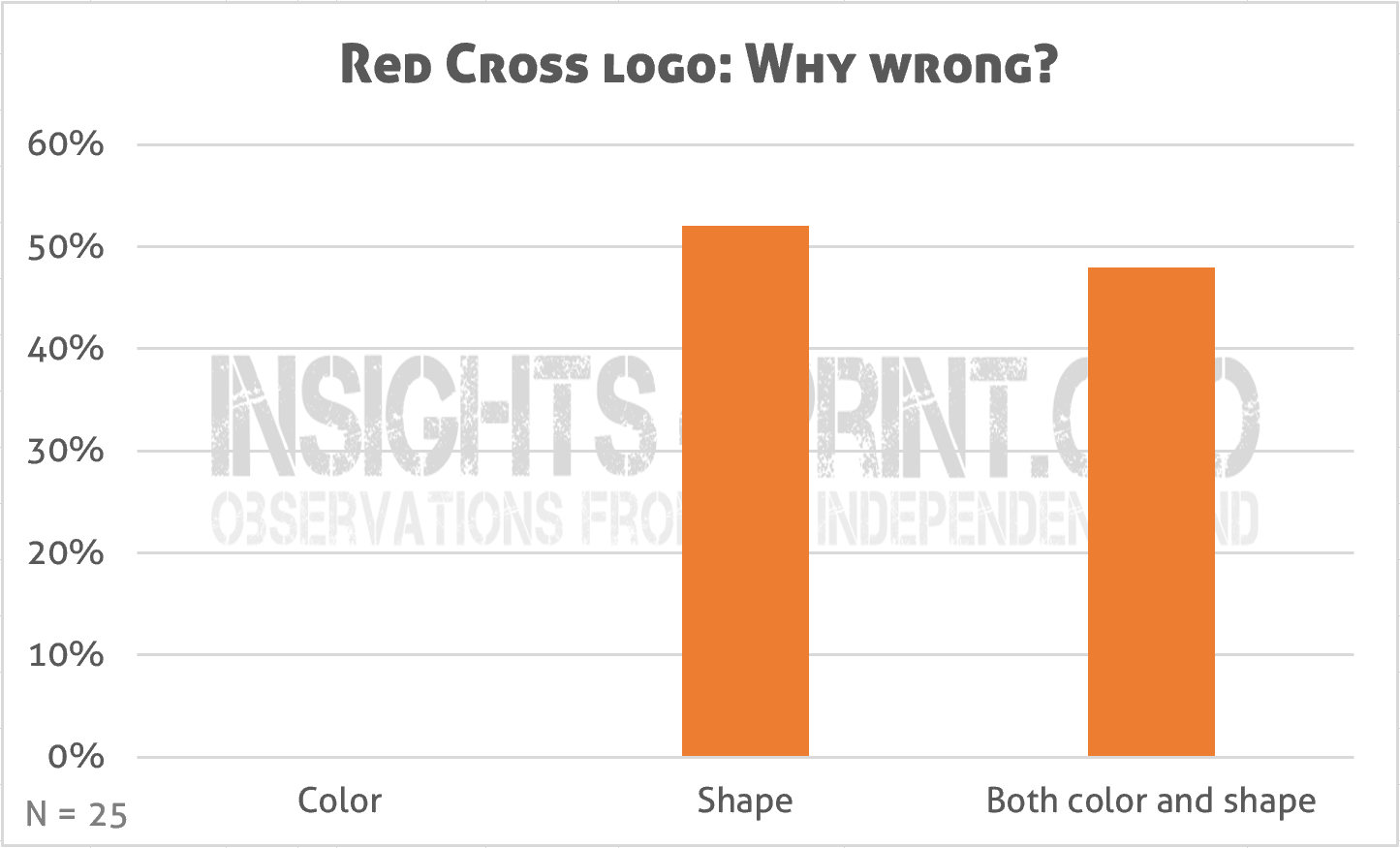
And if we look at why it was wrong, everybody said the shape was wrong. Even though the three had a different color, half of the respondents didn’t indicate ‘color’ in the reason why it was wrong. This proves my point: brand recognition is more about shape than about color.
Silly discussion…
Yes, I hear you: this is a silly discussion. Well, not really. In a professional (packaging) workflow, it won’t happen, but if you look at presentations and even some – amateurish – publications, you can see logos that were scaled asymmetrically and therefor distorted.
And even in packaging, it has happened: at the time when shrink-sleeve labels became popular, it has happened with bottles with special forms that logos were distorted during the shrinking process. Which sometimes made people wonder. It was only when software vendors came with solutions that could calculate the distortion and compensate for it, that logos appeared correctly in the final package.
Brand redesigns
However, there is a situation where ‘shape over color’ does matter: brand redesigns. There have been iconic, or infamous, redesigns that sometimes even have been reversed, where the color scheme stayed the same, but the shape was quite different. Which hurt the brand recognition by the public.
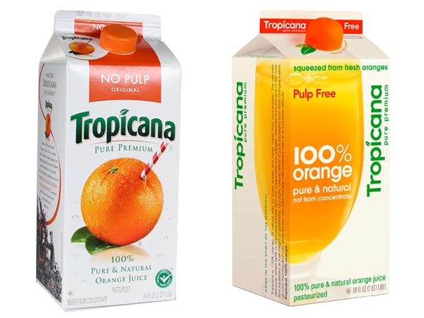
Probably the best know brand redesign failure is Tropicana. And it was reversed. The new branding, although the same color scheme, was too different in shape from the old one. People just didn’t recognize it anymore. You can find a lot of articles on it, including the cost of the operation. Here is one.
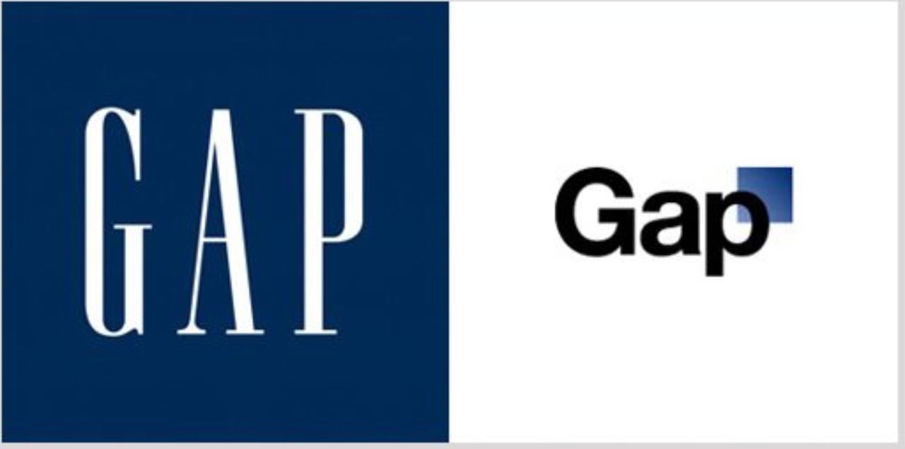
And maybe even worse, was the – very brief – rebranding of GAP. It didn’t even take one week before it was reversed. Again, the color stayed the same (although it became a gradient into a lighter blue). But the font changed, the overall look changed. Here you can read more about this infamous rebranding effort.
But there are also examples where the colors changed while keeping the shape, without hurting brand recognition. The most famous example: Apple. When you look at the evolution of the Apple logo, you will see multiple different color schemes, from a multitude of colors, to pure black or gray. But the – iconic – shape stayed the same. And nobody had problems recognizing the Apple logo, the Apple brand. Color isn’t as important as some people claim when it comes to brand recognition. This figure gives a nice overview of the evolution of the Apple logo.
Why is this important?
People involved with print or packaging production assume that color is the most critical feature of a brand, of a brand logo. But it isn’t. As I showed in previous articles, it is only the general color category (red, green, blue, purple, …) that consumers, that our brain will use to find a specific brand in the supermarket. It’s not about colors that are within a few delta E of the ‘official’ brand color definition. It’s about the more general colors.
And as shown in this article: shape matters more than color. Please keep that in mind when you do a press check. And certainly keep that in mind when doing a rebranding.
I agree that the shape of an official logo is probably more important than the color(s) today.
Having said that, I believe it is not a good measurement on the importance of consistency in brand colors to use b/w logos like the new Apple logo or the Nike logo as examples – since black is by definition not a color – it is classic and doesn’t reveal any emotion – cold – like a black suit for men is always safe.
We have always had b/w variations of logos, – made for use in b/w printing or simply where it is not possible to use the color version for some reason.
I furthermore believe it is not fair to test people today and ask them to pick out the “right” color for any brand in a world where designers and consumers are brought up seeing those same brand colors in different color variations – simply because the colors are not properly defined and not media neutral, – but media reliant (i.e. the colors change depending on the media and papertype, white point, print standard etc.).
How could you expect anyone to be able to pick the RIGHT color of Coca Cola on their native sRGB monitor, when, if you google “Coca Cola red” you will probably find 3-4 different color variations? Same with the printed variations of Coca Cola red. The last time I checked, it was defined with a fixed ink recipe (Coca Cola Red) – and a fixed CMYK halftone and no reference to an ISO standard.
I am confident I don’t have to explain to you what that means.
In fact I bet this is exactly why Apple gave up on using colors in their old, colorful logo (which was super appropriate for primary customer base – designers) and just switched to b/w to avoid this embarrassment and I’m sure constant complaints from their ad agency. Nice safe and understandable – back then.
I believe you should wait a few years until a few global companies have been using media neutral SMS colors as their primary brand colors for a few years to see if those colors aren’t hardwired into the retina of both professionals and consumers.
At this time the brand colors will be more important than any logo, I’m sure.
In fact graphic designers working with SMS colors will, after say 1 year of successful marketing be able to skip the logo and trigger a subconscious connection to any brand, only using the SMS brand colors to make up an advertisement, – to paint a city bus or a house etc.
If they dare to attempt this in my lifetime is another matter – but it would be an interesting experiment, if nothing else.
Best regards
Ingi
Thanks for your comment Ingi!
I agree on the first part: brand colors in real life can be quite different.
But I don’t agree with the rest of your comment. Where there exists an ‘absolute pitch’ when it comes to hearing and identifying tones, this doesn’t exist in vision. There is no ‘absolute color pitch’. I’ve already shown several examples of studies looking into the reliability of our color vision. Our color vision is flawed, it’s certainly not absolute (that’s why we use devices like spectrophotometers). So it just doesn’t matter if a color deviates a bit, as long as it is the right color category, people will see it as the brand color, e.g. ‘Coke Red’.
But a simple system that provides more consistent colors than a certain system for spot colors, is of course welcome.
Hey Eddy, Happy New Year by the way.
I honestly think there are about as many people in the world that have a perfect color tone eye, as there are that have a perfect ear for tones/pitch (my ear is very close to being like this – and it is no fun believe me, especially if you are a performing musician).
The main reason we don’t KNOW this is simply because – well until now there has not been a single brand color presented worldwide – or a combination of brand colors, which has been kept color consistent for any considerable period of time – not even within a single media, – let alone in all media at the same time.
This is due to gamut restrictions of the color palettes that have been available to designers until now, coupled with lack of standardization and the fact that a lot of professionals in both design and print actually LIKE a bit of chaos to give them room to make up excuses if they don’t live up to even their own expectations within their respective field.
So, imagine how hard it would be for even the most musical people to decide the right pitch of a popular song if each time they heard that song, it was in a different pitch – always different, just depending on the instrument playing the song.
Now, this would not be a terrible problem if you only heard the song from one instrument at the time or one band at the time – like it was in the olden days.
But in the 21st century consumers hear the same song being played by several performers at the same time – each playing in a different pitch, which makes it unbearable to listen to if you are a musical person, boring to listen to for just about anyone else that has a hearing.
Individually each performer sounds perfect but put them together in a room and they sound like a band of amateurs and it is impossible for anyone listening to tell who is playing in the right key – if any – and of course that doesn’t matter anymore.
This is the situation with brand colors today, like it or not.
You can google just about any brand color you know and you will get 3-4 different color variations of their “official logo” pr. search. Which one is the RIGHT one? Look at their colors in print on a few types of paper and put all the variations of their color together in front of you and then you tell me your opinion of who-ever is in charge of their visual brand identity, – and at the same time you tell me which is the RIGHT color.
Since you brought up spot colors, I would honestly love to get your professional opinion on the latest player in the spot color market – Spot Matching System (“SMS color”) which in fact could be considered a solution for brand designers and brand owners that are tired of hardly knowing what their own brand colors should look like – 500 perfectly color consistent, industry standard colors – that color savvy graphic designers can optionally “mix” (as gradients for instance) to their satisfaction.
SMS colors remain the same (within a DE2000 of 0,5 or so) in standardized CMYK printing on coated and uncoated paper (ISO 12647), online for even your smartphone display or tablet (sRGB) and on television/cinema (Rec. 709).
The official website is http://www.spotmatchingsystem.com.
Happy new year to you too Ingi!
At first I thought that I had to disagree with you again, this time on people with perfect (color) pitch. But after checking something, I had to adjust my opinion.
What I checked: how many notes are there? (Yes, I’m a savage when it comes to things like this) Twelve. So, people with a perfect or absolute pitch can recognize the 12 different notes without a reference tone. To keep the comparison equal, having a ‘perfect color pitch’ would mean that one would be able to recognize 12 colors, without the use of a reference. And that’s what most people can do! So, you are right on that! There are probably as many people with a perfect (sound) pitch as there are with a perfect color pitch!
But recognizing more colors than those twelve? That’s a lot harder and that’s where we fail. I discussed this in serveral articles, e.g. this one on our flawed color memory and this one on on the naming of colors.
You may be right my friend – but you may also be wrong. We can only check this a few years from now when absolute SMS colors (more than 12) have been in use for a few years. Until then we will just have to agree to disagree on this. And even if in a few years we find out that few or even no people have a perfect color pitch (i.e. are not able to memorize any color well enough to recognize it from similar colors), – even then I will prefer perfect color consistency to constant color fluctuations. I find those un-professional – in the same league as typos (which I also despise).
From a production point of view, having easy to reproduce colors is of course much better. Totally agree.
But my concerns/queste are on the customer side: who makes a lot of troubles when deviations are small, but not extremely small. Deviations that aren’t visible when you place the samples a few centimeter apart, let alone visible to a consumer who rushes down the aisles. And when that customer makes troubles, this often means demanding a discount… That’s what I’m fighting: getting real when it comes to small deviations and consumer perception, sales.
I agree. Occasional small deviations in a brand color are not noticeable to most people. Even the most demanding brand owners/customers should realize that there will ALWAYS be some deviations in reproduction of their brand colors – even when SMS colors are used correctly from the beginning of the design phase and onwards into production. This is what we refer to as production variations. Those can be kept to a minimum using top of the line inline measurement devices and having operators that are trained to look for deviations in their production.
What annoys me as perfectionist who has spent a lot of effort on coming up with the perfect path to color, – in fact the reason I started thinking about the Spot Matching System as an offset/litho printer back in 2000 or so is when brand colors are so casually defined at the design phase that they are “wide open” to major color fluctuations at the production stage, – because the manufacturer/printer doesn’t know the target color (in regards of LAB for instance, which is what SMS colors rely on at the core) and they don’t know which standard they are expected to use for the output of the job.
Meanwhile, should the printer dare to call up the designer to check this, the typical reaction he might get would be “You decide. You are the printer. Just make it look nice.” – and then by default they agree that the deviation is within reason, should the customer complain.
SMS colors have these basic instructions, based on universal/ISO standards for designers, printers and manufacturers built in, so at least everyone from designer to printer/manufacturer knows what is expected of them when they are working with SMS colors – and each SMS color can be measured and checked spectrally on and off press.
The same is not true when you are working with a blind 80c35m15y8k because this combination can result in several colors, – depending on the material you are printing on, the ink density used by the printer and the press curve / TVI on the press used to print the job.
This is regrettably the default standard in the world today – prescribed color chaos from the get-go.
So let’s say we wanted to completely stop demanding print customers/perfectionists even complaining about their brand colors being different here and there and insisting on getting a discount, at least we should agree that 1) the brand colors should be defined by their visual appearance and 2) should be reproducible in production. If we agree on this, we can start talking about “fixed colors” – which is what SMS colors are – fixed visually.
Otherwise there can be no process control, no standardization and no clinical quality control to at least give printers a fighting chance of hitting the original brand colors they are expected to hit within a shouting distance.
Best regards from Iceland
Ingi
Yep, badly designed brand guides are a (or THE) key issue… I wrote this article about it, which covers two papers by Michael Abildgaard Pedersen and my own experiences in this field.
Plus: I made a proposal for a ‘fool proof’ brand guide… That’s where it all starts… Even though it’s a tough exercise, it is essential to create a brand guide that isn’t open for interpretation.