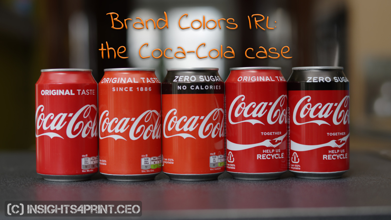
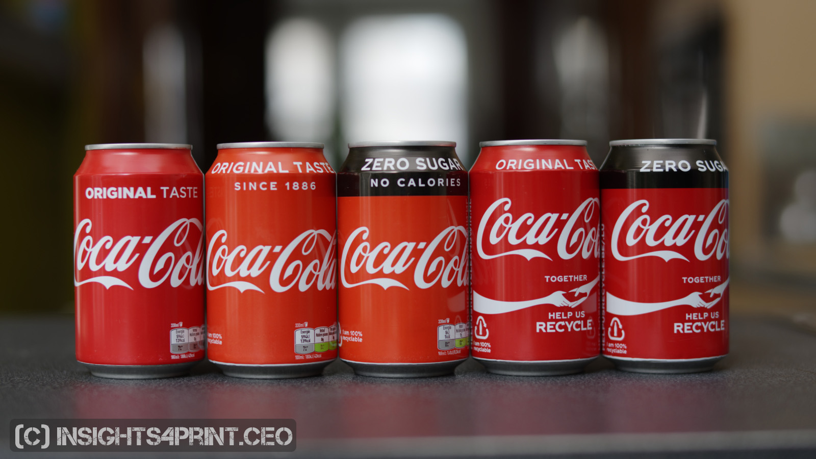
After having seen how my color memory messed up with a package of Kellogg’s, I thought that it happened again when the cans of Coca-Cola seemed much lighter and a bit more yellowish than usual. So, I thought I had another nice example of how my color memory failed. Until I was at home and put it next to the other samples in my Coca-Cola can collection… This one was different! And this wasn’t the last encounter with deviating Coca-Cola cans…
CONTENTS: Deviations | The Coca-Cola website: FAQ and rumors | Why is this important? | PS: do you recognize this brand? | Upsdate
Over the years, I’ve collected a few dozen of Coca-Cola cans, with different designs. But one thing has always been rather accurate: the color red. The deviations between the different cans were really minor. They were that small that I couldn’t trust my eyes/brain to be sure if there was a difference or not. But that has changed…
I did not only encounter the lighter/ yellowish version of regular Coca-Cola, also the Coca-Cola ZERO was lighter/more yellowish (which could, of course, be logical: they might have been printed at the same printer, at the same moment). And about a month later, when I visited a friend, I noticed a can of Coca-Cola on the table, which seemed much darker than usual, certainly darker than the one I recently bought. So I took it home, and yes: it was a lot darker. A lot darker than the one from a month earlier, but also darker than the older cans (let’s call those the ‘reference cans’). And when I entered a shop a few weeks later, there was a light/yellowish one next to a dark Coca-Cola ZERO! So I also bought the dark Coca-Cola ZERO, which turned out to be even slightly darker than the ‘regular’ darker can I had.
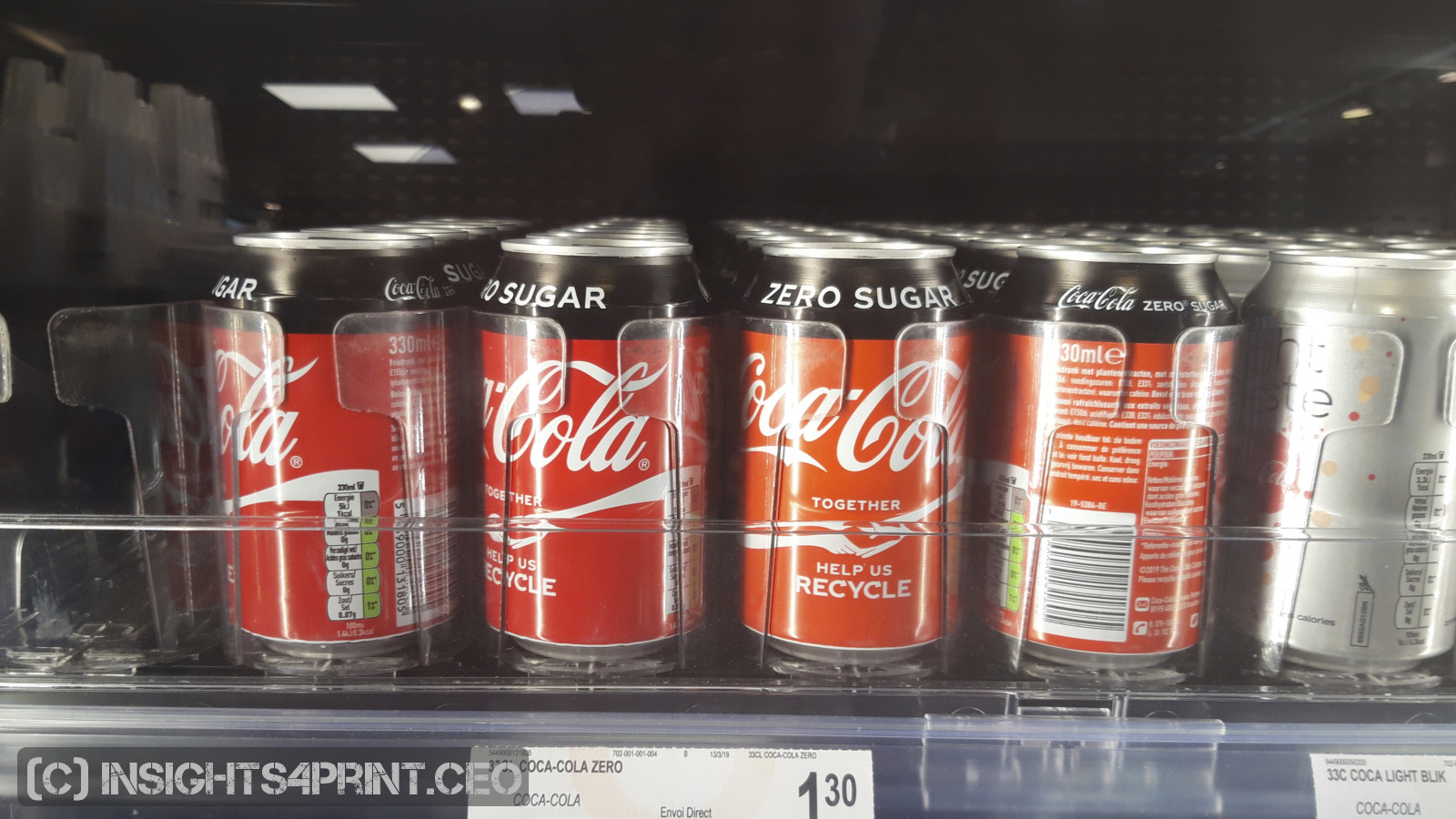
If it is correct that color deviations in packages will damage brand trust and consumers will not buy the ‘deviating’ packages, Coca-Cola must have seen a significant decline in their turnover in Belgium the last few months… Or, maybe consumers don’t care. Probably the weather has had a much bigger influence on sales of Coca-Cola than deviating colors (we had several heath waves in Belgium this summer).
The Coca-Cola website: FAQ and rumors
Just out of curiosity, I checked the website of Coca-Cola Belgium, but there is no information to be found on the different color of the Coca-Cola cans. Now, if it were true that consumers would not trust a can that looks different, wouldn’t Coca Cola Belgium have gotten questions about that, from worried consumers? (they do have a contact form for concerns about product and package quality on the website) Wouldn’t Coca-Cola Belgium have seen a significant decline in their sales figures? And wouldn’t they have investigated what could have caused that decline? And when they found the deviating cans to be the cause, wouldn’t they have assured the consumers about the product quality via a press release, or a mention in the FAQ? Well, nothing of this kind happened. However, they do have a special page on all kinds of rumors that can damage their brand, e.g. that you can dissolve a tooth in Coca-Cola… But nothing on the color of cans.
This article is of course about color memory, which is harder than comparing colors. But you might want to read a previous article that shows deviations of Kellogg’s red within different packages on the same shelve.
Why is this important?
Color is an important part a brand’s logo, its identity. But what is acceptable as deviations, and I mean in real life? As I’ve shown and argumented in other articles: the maximum tolerances some claim, 2 dE00, are just silly. Regular consumers won’t notice them. Measurements of the same color with two different spectrophotometers can even be 2 dE00 apart! And when using physical Pantone Color Guides as a reference: they are often more than 2 dE00 apart…
Color is an important part a brand’s logo, its identity. But what is acceptable as deviations, and I mean in real life? As I’ve shown and argumented in other articles: the maximum tolerances some claim, 2 dE00, are just silly. Regular consumers won’t notice them. Measurements of the same color with two different spectrophotometers can even be 2 dE00 apart! And when using physical Pantone Color Guides as a reference: they are often more than 2 dE00 apart…
So, let’s get real about deviations in print, in packaging. The ISO-standards are a good reference, tighter tolerances are not necessary.
And to show how ‘warped’ the printing industry ‘echo chamber’ demanding ultra-low tolerances is, here is a comment I recently got on the Coca-Cola red memory test: “No offense, but this entire thing is rather silly. I understand the premise and I understand what you are trying to prove. You have chosen a color that has evolved more times than the salamander or the fish. As a person looking to restore an antique vending machine I came across your page and have to say, almost every color you show in your swatch has been used, at some time, by the coca-cola co. There are more than 25 different codes just for vending machines, and I cannot imagine what the number would be for advertising purposes. (…)”
PS: do you recognize the brand on the picture below?
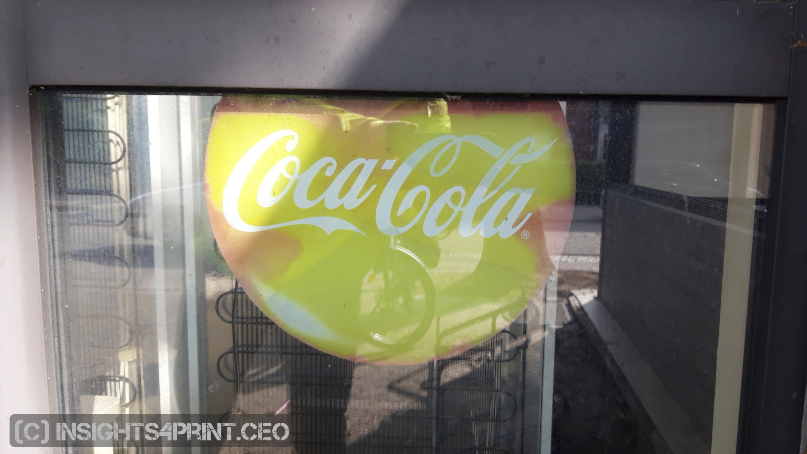
Did you recognize it? Which brand is it? Please, say it out loud!
I guess you said Coca-Cola. But the colors are completely wrong: this isn’t red anymore! It’s a greenish yellow! The colors are completely degraded due to exposure to UV-light. But the form is still correct: the letters Coca-Cola are just the way you expect it. And that might be much more important for recognizing a brand than the colors. BTW: this seems like an interesting topic for a research project. If you are a student, researcher and you would like to test this, feel free to contact me! I’ll be glad to help you set up such an experiment.
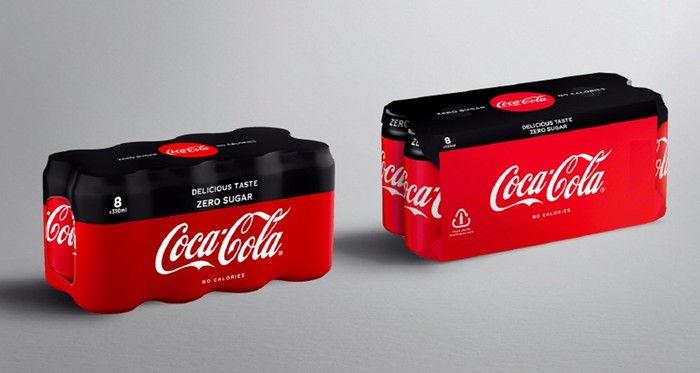
UPDATE 23/09/2019: today Coca-Cola European Partners sent out a press release on a new initiative, replacing shrink wrap by cardboard. With the press release, there was an image showing an ‘old’ sixpack with shrink wrap and a ‘new’ one with cardboard. Well, take a look at the picture: is that the same red? Not really… Now, you could argue that there is a shadow on the ‘old’ one, influencing the color. Might be: but then look at the logo’s at the top of the sixpacks (sorry: eightpacks!), these don’t match the color on the front… So, how important is a consitent brand color?
(Visited 915 times, 1 visits today)


Beste Eddy,
De grootste fout die Coca-Cola hier maakt: de “six” pack is a “eight”pack
Sorry, gecorrigeerd! Tja, dat krijg je als je enkel naar de kleur kijkt… 😉