

Are professionals better at judging color? Your immediate response will probably be: “Of course, they’re professionals!” It would seem no more than logical. But based on some tests, the answer might not be that straight forward… And I guess not everybody will like what I’m going to show you in this article…
CONTENTS: Remembering brand colors | Judging color differences | The uncertainty principle | Why is this important?
Recently I got the following response to one of my tweets: “I think (like anything) with training, or experience, professional color people would get closer to the coke red than the untrained public.” And it does seem logical that trained, experienced people will be better at recognizing color, or at judging color in a more general sense. But let’s take a look at a few experiments I did, where I could make a distinction between people who are professionally involved with print (the ‘professionals’) and others.
Remembering brand colors
The basis for the comment on Twitter was the Coca-Cola red test. In case you don’t know that one yet: I showed people six variations of red and asked which one was the right ‘Coke red’. The results show that people are really bad at it: about 1 out of 6 got it right… With six possibilities, that’s just random.
The basis for the comment on Twitter was the Coca-Cola red test. In case you don’t know that one yet: I showed people six variations of red and asked which one was the right ‘Coke red’. The results show that people are really bad at it: about 1 out of 6 got it right… With six possibilities, that’s just random.
So, the next question: is there a difference between people who are professionally involved with print and others? Let’s take a look at the graph below. As you can see: the difference is marginal, insignificant.
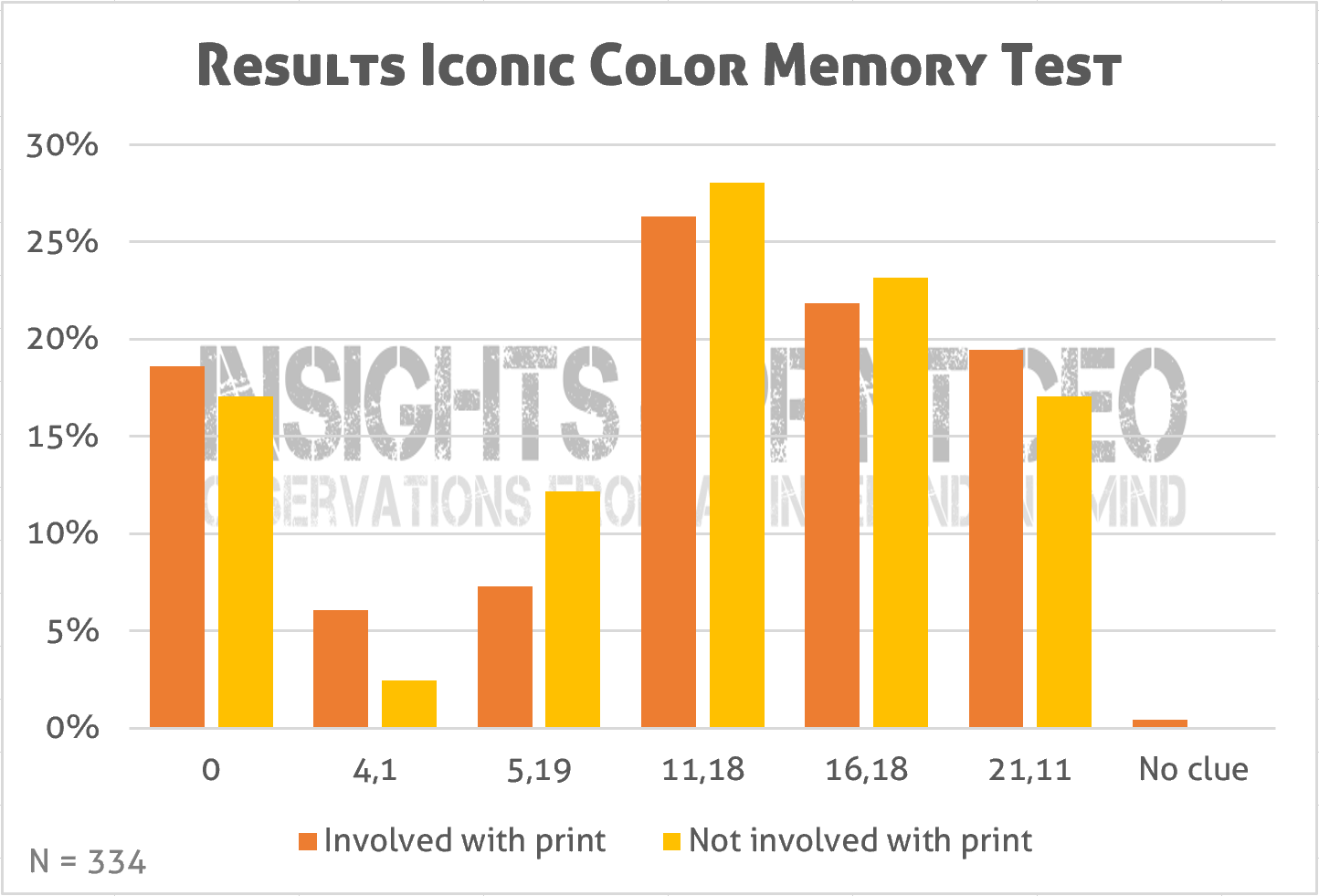
But I used this test also a second time, as part of a survey, so in a different context. In the first test, it was kind of a challenge: how good is your color memory? Can you identify the right Coca-Cola red? In the survey, which was on shopping behavior, there was no challenge, I only asked which version of the logo was the right one (even without specifying that they had to judge the color). This might seem insignificant, but there is a difference: a slightly different setting gave rather different results.
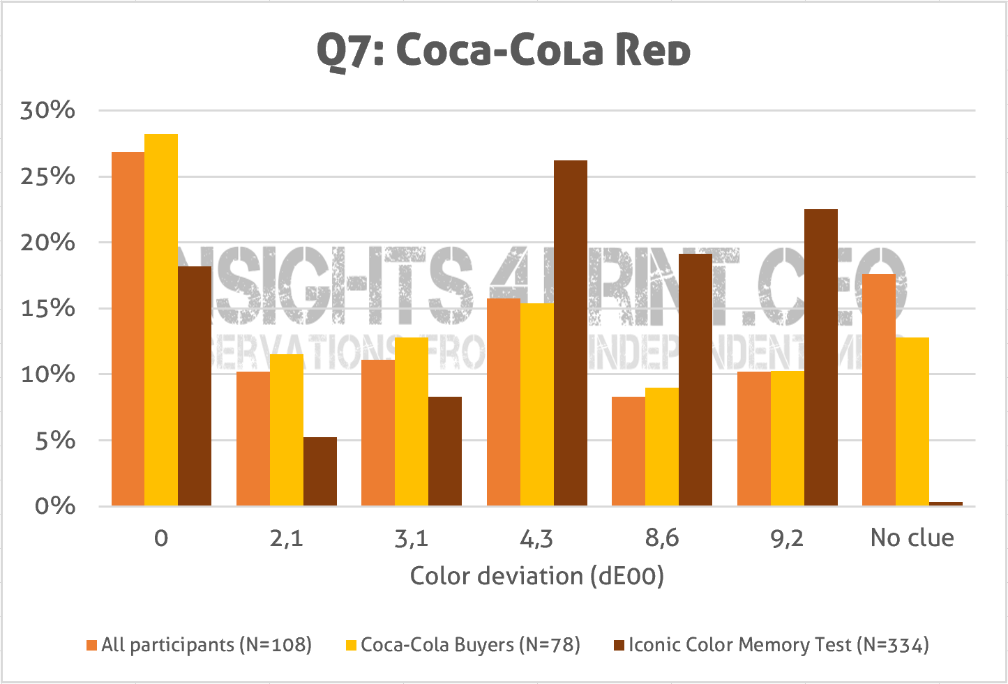
There are two interesting facts about this graph. The first is that the participants in the shopping behavior survey, which had only 2 persons from printing industry on a total of 108, were better able to identify the right variation of red. With a slightly better result for people that actually buy Coca-Cola.
The second is on the other side of the graph: much more people answered that they didn’t have a clue. In the color memory challenge, only 1 out of 334 said he/she didn’t have a clue. My guess is that this is due to the setup of the test, the challenge: nobody wanted to admit that they didn’t know, that their memory failed. It would have given them a bad feeling if they had to admit they didn’t know. While in the shopping survey, there was no judgment involved, people were not left with a bad feeling if they admitted they had no clue.
Judging color differences
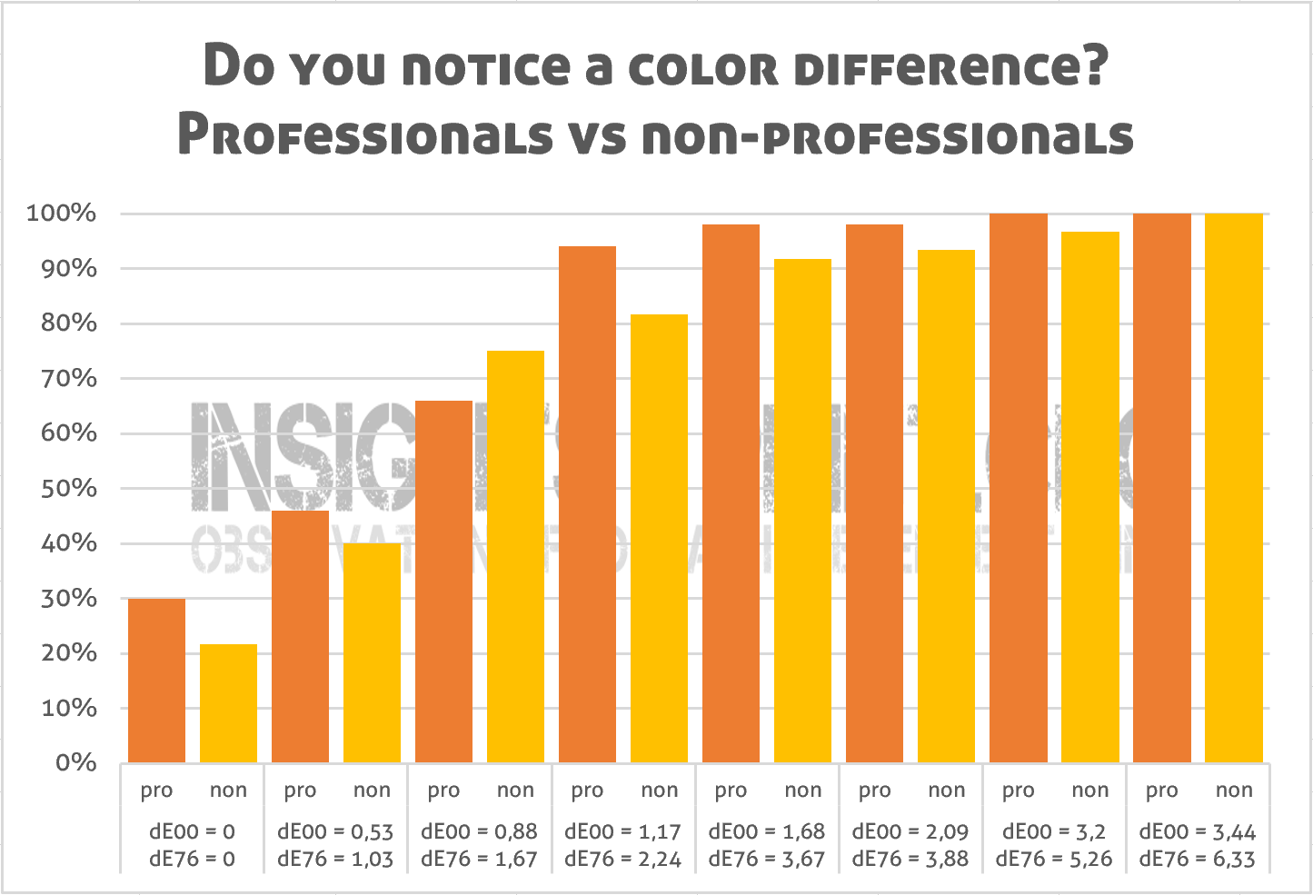
Much more important than having a correct color memory, is being able to judge, to see color differences. This is what is being done on a daily basis in every print shop around the world: a press operator, a print buyer compares the proof or previous order with a job that is being printed at that time. So you would guess that professionals will be much better at that. Well…
Much more important than having a correct color memory, is being able to judge, to see color differences. This is what is being done on a daily basis in every print shop around the world: a press operator, a print buyer compares the proof or previous order with a job that is being printed at that time. So you would guess that professionals will be much better at that. Well…
In the article about a groundbreaking color study, I showed that this isn’t the case. There was something interesting about this study, probably a world first: the set of samples that had to be compared with a reference also included one sample that was identical to the reference. And that revealed something very inconvenient: almost one out of three ‘professionals’ (30% of 50 participants involved with printing) claimed to see a color difference between the identical copies! Which was higher than the others: about one out of five (22% of 60 participants not involved with printing).
The uncertainty principle
How can we explain the findings I showed above? It’s rather simple: it’s psychology. And I already explained it in a previous article, in my theory: ‘the uncertainty principle of visual color evaluations’. Which says that the moment you are aware that you are judging colors, you can’t be objective anymore about that color evaluation. Or to put it in other words: you will be trying to hard, you will become an overachiever and will amplify what you see, maybe even see things that aren’t there, which is clearly shown in the test above. Read the original article for more information!
How can we explain the findings I showed above? It’s rather simple: it’s psychology. And I already explained it in a previous article, in my theory: ‘the uncertainty principle of visual color evaluations’. Which says that the moment you are aware that you are judging colors, you can’t be objective anymore about that color evaluation. Or to put it in other words: you will be trying to hard, you will become an overachiever and will amplify what you see, maybe even see things that aren’t there, which is clearly shown in the test above. Read the original article for more information!
Why is this important?
In the printing industry, the human eye (and the brain behind that eye) still is an important instrument when it comes to judging color and certainly color differences. You would expect that professionals are better at it, but as the tests above show, that isn’t necessarily the case… The setting can influence behavior (e.g. it’s a print buyer’s job to find color differences during a press check, so he/she will look untill he/she finds color differences) and professionals can try too hard, because they are professionals.
In the printing industry, the human eye (and the brain behind that eye) still is an important instrument when it comes to judging color and certainly color differences. You would expect that professionals are better at it, but as the tests above show, that isn’t necessarily the case… The setting can influence behavior (e.g. it’s a print buyer’s job to find color differences during a press check, so he/she will look untill he/she finds color differences) and professionals can try too hard, because they are professionals.
Some, maybe many people won’t like this and I might get some hate mail and comments on this. But this is what I found, what I observed. I would love to see others replicate these test, or come up with other tests, to either confirm, or reject it. But if you do want to perform a similar test: never forget to include a ‘validity check’, like that identical copy in the color difference test. Otherwise the results will be flawed.
(Visited 907 times, 1 visits today)
Hey Eddy
I believe professionals in print in the 21st century use spectral instruments to check color in regards of CIELAB. In the real world, when it is your job to decide if the color is right or wrong, anyone who relies on his eyes to decide whether the Coke Red is correct or not is not a professional, – in my humble opinion.
Right you are Ingi! Especially now that spectrophotometers have become cheaper and there now even is an offering costing only a few hundred euro/dollar (http://variableinc.com/spectro.html) instead of several thousands.
Very nice article and surprising findings….Would be interesting to break it down by sex, so how did females compare to males.